Design Trends
We love watching design grow and change in Melbourne, and we've noticed some techniques that we believe could be the trends of this year. Whether it's a new website header, fresh detail on your company logo or a complete re-brand, your graphics will benefit from the inclusion of some of the following.
Flat design
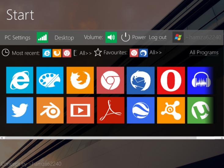
Flat design has been absolutely massive this year. It lets the design speak for itself, without the use of flashy drop shadows and gradients, ensuring the image is functional, crisp and clean.
This simple design places all the focus on the content and doesn't distract, presenting information and images in a way that doesn't hide behind over-designing. To ensure this is still engaging and compelling, many designers are turning to bold colour in order to capture the attention of their audience. If you're going for a minimalist look that communicates your information in a sophisticated way, flat design could be the option for you.

Geometric details
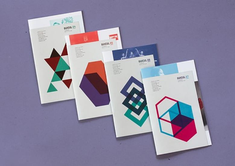
If you've noticed an increase in the number of shapes popping up in design over the past few months, you're picking up on this trend. Detailed yet simple, this geometric way of presenting graphics requires plenty of skills and attention. Some designers are using geometric patterns in extremely creative ways, tracing images and filling them with shapes rather than their traditional detail.

Experimental typography
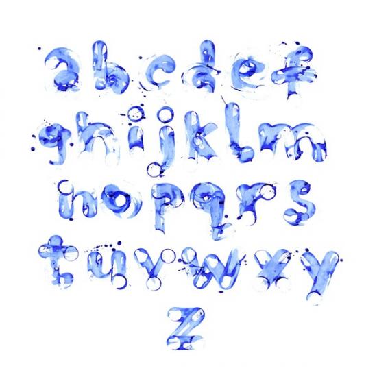
This year there has been a lot of focus on fonts and typography, and being really creative with the ones you use in your branding. Opt for a mix and match effect, which can break up the page to prevent content from becoming too cluttered as well as drawing the eye to key words and phrases.
Handwritten fonts are also really effective in adding a personal, intimate feel to any image or design. Use rounded letters for a casual vibe, or use large and intricate serifs to add an elegant feel for a unique way to present your brand image.

Print Together - online printing service in Melbourne and whole Australia